
三、python数据分析matplotlib库的使用
- 计算机科学
- 2022-07-10
- 111热度
- 0评论
python大数据与机器学习与商业实战
一、数据分析numpy、pandas、matploylib库的使用
7 基本图表绘制
7.1 折线图 plt.plot
import matplotlib.pyplot as plt
x = [1,2,3]
y = [2,4,6]
plt.plot(x,y)
plt.show()

import numpy as np
import matplotlib.pyplot as plt
x1 = np.array([1,2,3])
y1 = x1 + 1 #第一条线
plt.plot(x1,y1)
y2 = x1*2 #第二条线
plt.plot(x1,y2,color='red',linewidth=3,linestyle='--')
#color颜色 linewidth线宽 linestyle线型默认实线
plt.show()

7.2 柱形图 plt.bar()
import matplotlib.pyplot as plt
x = [1,2,3,4,5]
y = [5,4,3,2,1]
plt.bar(x,y)
plt.show()

7.3 散点图 plt.scatter
import matplotlib.pyplot as plt
import numpy as np
x = np.random.rand(100)
y = np.random.rand(100)
plt.scatter(x,y)
plt.show()

7.4 直方图 plt.hist
import matplotlib.pyplot as plt
import numpy as np
data = np.random.randn(10000) # 10000个服从标准正态分布的数据
plt.hist(data,bins=40,edgecolor='black') #bings 颗粒度即柱的数量 ,edgecolor柱边框颜色
plt.show()

7.5 pandas库绘制图表
import pandas as pd
df = pd.DataFrame(data)#将前面数组转化为DataFrame格式
df.hist(bins=40,edgecolor='black')#df['列名'.hist]
array([[<AxesSubplot:title={'center':'0'}>]], dtype=object)

df.plot(kind='hist') #直接通过设置kind参数为hist来绘制直方图
<AxesSubplot:ylabel='Frequency'>

import matplotlib.pyplot as plt
plt.rcParams['font.sans-serif']=['SimHei'] #用来正常显示中文标签
plt.rcParams['axes.unicode_minus']=False #用来正常显示负号 解决中文乱码的情况
df = pd.DataFrame([[8000,6000],[7000,5000],[6500,4000]],
columns=['人均收入','人均支出'],index=['北京','上海','广州'])
df['人均收入'].plot(kind='line')# line表示为折线图
df['人均收入'].plot(kind='bar')
<AxesSubplot:>

df['人均收入'].plot(kind='pie')#饼图
df['人均收入'].plot(kind='box')#箱体图
df['人均收入'].plot(kind='hist')#直方图
df['人均收入'].plot(kind='area')#面积图
<AxesSubplot:ylabel='Frequency'>

8 可视化常用技巧
8.1 添加文字说明 plt.xlabel() plt.ylabel()
import matplotlib.pyplot as plt
x = [1,2,3]
y = [2,4,6]
plt.plot(x,y)
plt.title('TLTLE') #添加图表标题
plt.xlabel('X轴') # x轴标签
plt.ylabel('Y轴') # y轴标签
plt.show()

8.2 添加图例 plt.legend() 需要设置好label标签参数
x1 = np.array([1,2,3])
y1 = x1 + 1
plt.plot(x1,y1,label='y = x + 1') #第一条线设置
y2 = x1 * 2
plt.plot(x1,y2,color='red',linestyle='--',label='y = x * 2') #第二条线设置
plt.legend(loc='upper left')
plt.show()

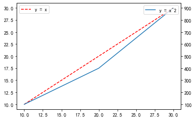
8.3 设置双坐标轴 plt.twinx() 双轴需要每次都添加图例
x1 = np.array([10,20,30])
y1 = x1
plt.plot(x1,y1,color='red',linestyle='--',label='y = x')
plt.legend(loc='upper left')
plt.twinx()
y2 = x1*x1
plt.plot(x1,y2,label='y = x^2')
plt.legend(loc='upper right')
plt.show()
8.5 设置图表大小
plt.rcParams['figure.figsize']=(8,6) #第一个为长400像素,第二个为宽300像素
8.6 设置x轴刻度的角度
plt.xticks(rotation=45)
(array([0. , 0.2, 0.4, 0.6, 0.8, 1. ]),
[Text(0, 0, ''),
Text(0, 0, ''),
Text(0, 0, ''),
Text(0, 0, ''),
Text(0, 0, ''),
Text(0, 0, '')])

8.7 中文显示问题
黑体 SimHei
微软雅黑 Microsoft YaHei
宋体 SimSun
新宋体 NSimSun
仿宋 FangSong
楷体 KaiTi
细明体 MingLiU
新细明体 PMingLiU
import matplotlib.pyplot as plt
plt.rcParams['font.sans-serif']=['SimHei'] #正常显示中文
plt.rcParams['axes.unicode_minus']=False #解决负号不显示的问题
8.8 绘制多图 subplot() subplots()
ax1 = plt.subplot(221) # 行数 列数 当前图的序号
plt.plot([1,2,3],[2,4,6])
ax2 = plt.subplot(222)
plt.bar([1,2,3],[2,4,6])
ax3 = plt.subplot(223)
plt.scatter([1,3,5],[2,4,6])
ax4 = plt.subplot(224)
plt.hist([2,2,2,3,4])
plt.show()

# 一次性生成多张子图
fig, axes = plt.subplots(2,2,figsize=(10,8)) # nrows行数 ncols列数=plt.subplots(2,2)
ax1, ax2, ax3, ax4 = axes.flatten() # 获得四张子图 注意后面那个括号
ax1.plot([1,2,3],[2,4,6])
ax2.bar([1,2,3],[2,4,6])
ax3.scatter([1,3,5],[2,4,6])
ax4.hist([2,2,2,3,4])
(array([3., 0., 0., 0., 0., 1., 0., 0., 0., 1.]),
array([2. , 2.2, 2.4, 2.6, 2.8, 3. , 3.2, 3.4, 3.6, 3.8, 4. ]),
<BarContainer object of 10 artists>)

